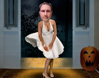
If you’re looking for a little Halloween fun, check out The Halloweenies from American Greetings.
Happy Halloween everyone.
October 31, 2007
October 29, 2007
Tune In Monday
I usually leave music recommendations to Paul at hee-haw marketing.
But if you enjoy catchy synth pop beats and fun lyrics, check out Cynsin from Austin. Or just go ahead and download their album.
I’m sure it’s only a matter of time before you see them on Adtunes.
But if you enjoy catchy synth pop beats and fun lyrics, check out Cynsin from Austin. Or just go ahead and download their album.
I’m sure it’s only a matter of time before you see them on Adtunes.
October 28, 2007
How’s your eyesight?
Don’t know if Art Foco Otica or Bausch & Lomb ran this concept first. But I wish I could find a higher res image of either one.
October 26, 2007
Remember what finding your first job felt like?
My alma mater, Portfolio Center, held a Portfolio Review today at the Center for Architecture at 536 LaGuardia Place. Saw lots of great design and some smart thinking.
I should have posted it about this earlier in the week, but you can swing by before 7. And if any of the grads I met follow up, I'll post a link to their work here:
Theresa Budnik - writer
John Freeman - writer
Sarah McClure - designer
Craig Moyer - writer
Manoj Swearingen - art director
Tanya Frank - designer
Stephanie Richardson - photographer
October 25, 2007
Is this thing on?
Everyone loves a funny ad, but it’s even harder to pull off when the product you're selling is comedy.
The Gotham Comedy Club is worth checking out. I saw Jim Gaffigan of Sierra Mist fame do a funny set there a few weeks ago.
October 24, 2007
What should I be for Halloween this year?
Thanks to Click or Treat from Blue Mountain, you can try out different costumes without leaving your cubical.
It was bound to happen.
Virtual trick or treating.
You can also see how you’d look as a zombie without actually joining the undead with the Zombifier at kiwee.
It was bound to happen.
Virtual trick or treating.
You can also see how you’d look as a zombie without actually joining the undead with the Zombifier at kiwee.
October 23, 2007
Bet it wasn’t hard to find someone to do their ads
I haven’t signed up for the Freelancers Union, but I sure could have used some dental insurance the last time I was between full-time gigs.
October 22, 2007
Wanna get delayed?
October 17, 2007
Who needs punctuation?
I spent my time waiting in the security line at JFK trying to decide if this banner actually needs a question mark.
It wasn't really a problem until I started repeatedly reading it out loud with different inflections.
There's an old rule of thumb that says you should never phrase a headline as a question, because people may not think of the answer you want them to.
I say go ahead if you have a good reason, but at least use the proper punctuation so we both don’t look like idiots.
October 16, 2007
But do you know what, when, why and how?
October 12, 2007
Why not ask a copywriter about web design?
Q. Do you think this thing we've done to promote our little creative start-up is good? Or shit? See hightimewehadawebsite.com.
Cheers, Rob Mosley, Creative Director
A. Rob, I think it’s very good indeed. And you’ve certainly been getting attention from other advertising folks. So assuming that’s your goal, kudos.
To leverage this idea to attract potential clients as well, I think you need to go with the “Media: Mixed” concept. Not only because of where you could place the actual ads that become your web pages, but also because the crossover between off- and online is really interesting.
If you just want to go for laughs, it’s easy to see how “The Rocking Chair Test” could be a crowd favorite.
Good luck, BT
October 11, 2007
How do you turn great TV into great print?
Examples of how not to do it are easy to find. You just can't force one execution into every medium. It takes an idea that's interesting enough to generate a whole campaign of unique approaches.
October 10, 2007
Do you hate it when someone thinks they could write a better headline?
No, but it’s amusing when they try.
I wonder if whoever wrote the graffiti on this Sarah Silverman ad is actually a fan, because it sounds like something she would say.
October 9, 2007
October 8, 2007
October 5, 2007
Does this look big enough to you?
October 4, 2007
When is copyright infringement ok?
It certainly isn’t new , but advertising that plagiarizes other work seems to be a growing trend.
boing boing pointed out an Australian spot for Ricoh Printers that lifted dialogue from MIT researcher, Scott Aaronson.
Here’s the quote from his lecture:
“But if quantum mechanics isn’t physics in the usual sense — if it’s not about matter, or energy, or waves, or particles — then what is it about? From my perspective, it’s about information and probabilities and observables, and how they relate to each other.”
And here’s the commercial:
Now consider this poster I saw on the MTA.
Both are funny. Both use someone else’s words. The Family Guy ad can take the moral high ground since parody falls under fair use. But I think it’s an easy laugh. It might be harder to write an original line, but it’s always worth the effort.
October 3, 2007
Do we need another new media outlet?
I've seen floor clings inside, but never one on the sidewalk.
Saw this one in Times Square
And this one on 6th somewhere around 17th.
(Man, that Sarah Silverman really gets around.)
The world is already saturated with ads; so if you're going to stick one somewhere, make the creative worth the intrusion. At least the Silverman one tries to play off the placement. Of course, Kirshenbaum Bond + Partners already did it better years ago for an intimate apparel company with sidewalk stencils that said, "From here it looks like you could use some new underwear.”
October 2, 2007
I’m only posting this to make my girlfriend jealous.
October 1, 2007
Why did this campaign raise a stink?
This Mitchum Man campaign is old, but I just found this matchbook in a desk drawer.
I actually liked the ads, but maybe people were already tired of the backlash against metrosexuality.
Subscribe to:
Posts (Atom)